Responsive design: Optimize your website for a seamless multi-device experience
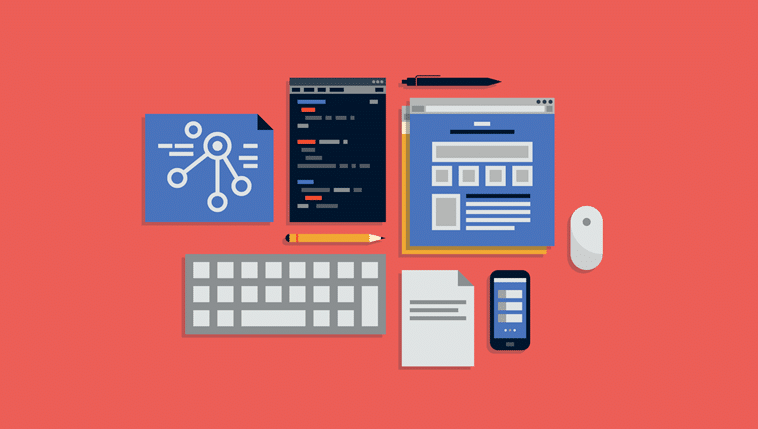
Today, far more demands are placed on website design than ever before.
A website must now be streamlined and easy to use, whether on a computer, mobile, or tablet.
To ensure the same experience across all platforms, responsive design is used.

What is responsive design?
Responsive design refers to the automatic adjustment that occurs when a user visits a website.
Depending on whether the user is on their mobile, tablet, or computer, the website will automatically adjust to the dimensions of the user’s screen to ensure the most optimal and streamlined experience.
Not only does the website’s design and text scale to fit the user’s screen, but the interactive elements of the website are also adjusted.
Using responsive design is, for many, the easiest and most recommended solution, rather than maintaining separate web pages tailored to each device type.
In other words, it reduces the resources otherwise needed to maintain and update multiple different pages.
Responsive design is a part of optimizing the User Experience on a website and is a small part of different tactics to ensure as easy browsing as possible.
Advantages of responsive design
As users today often switch between their mobiles, tablets, and computers to access websites and applications, offering a scaled and adapted website experience is a necessity.
This provides overall increased accessibility and an improved user experience, as users know they won’t miss anything, no matter which device they are using.
Imagine a user finds your website through an ad on their mobile while commuting on the bus.
The user wants to explore your website further but prefers to do so from their computer after returning home from work.
The user saves your website for later, and when they visit it on their computer, it will be the same, yet adapted, experience as it was on their mobile earlier.
If done right, it will also have a huge impact on your conversion rate.

Micky Weis
Freelance fractional CMO · 17 years in digital marketing · Copenhagen
Micky Weis er en af Danmarks mest erfarne digitale marketingeksperter med næsten 17 års erfaring. Han arbejder som fractional CMO og specialiserer sig i SEO, organisk vækst, AI i marketing, affiliate og kommerciel strategi. Han har arbejdet med brands som Hummel, Matas, Tattoodo og Firtal, og driver i dag sin egen praksis, Weisio, fra København.


Got a comment?
Commenting requires a login right now. If you have a question about this, send it over and I will reply directly.